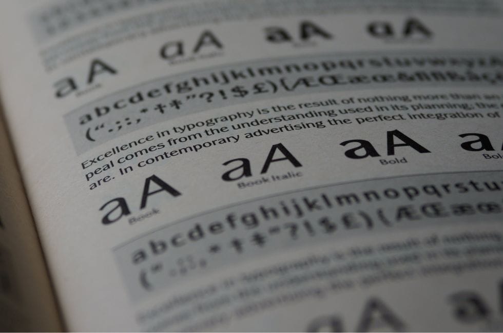
Typography, the art of arranging type, is a foundational element in graphic design. The careful selection of fonts can profoundly influence the aesthetics and readability of your print materials. In this blog post, we’ll delve into the fascinating world of typography and explore the key principles for selecting the ideal fonts to elevate your print designs.
Prioritise Legibility
Legibility is paramount in typography. No matter how stylish or unique a font may be, it must never compromise readability. When choosing fonts for your print materials, consider your target audience and the intended purpose. Ensure that the selected fonts are easy on the eyes and don’t cause confusion.
Example Fonts:
Arial: A clear and legible sans-serif font often used for digital and print materials.
Times New Roman: A classic serif font known for its readability in long blocks of text.
Align Fonts with Your Message
Typography should harmonise with the message or theme of your print design. For formal documents, opt for classic and elegant fonts such as Times New Roman. In contrast, if you’re creating a poster for a children’s event, a playful and decorative font may be more appropriate. Your chosen fonts should effectively convey the intended mood or message.
Example Fonts:
Playful Event Poster: Consider “Itim” for a light-hearted event poster.
Elegant Invitation: Opt for “Bodoni” to add a touch of sophistication.
Maintain Consistency
Consistency is a fundamental principle in design. Limit your font choices to two or three, and maintain uniformity throughout your design. This consistency in typography fosters a unified and visually appealing appearance, enhancing both readability and aesthetic appeal.
Example Fonts:
Primary Heading: “Montserrat” for a clean and modern look.
Body Text: “Lato” for legible and balanced body text.
Establish Visual Hierarchy
Creating a visual hierarchy is a pivotal aspect of print design. Use fonts to guide your reader’s eye through the content. Typically, employ a primary font for headings and a secondary font for body text. These distinctions in font styles, sizes, and weights help your audience navigate your content seamlessly.
Example Fonts:
Heading: “Raleway” for a bold and attention-grabbing heading.
Body Text: “Open Sans” for a simple and easy-to-read body text.
Balance Font Styles
Balancing font styles is crucial. If your heading features a bold and attention-grabbing font, complement it with a simpler and more neutral font for the body text. This contrast ensures that your print materials are engaging without overwhelming the reader.
Example Fonts
Bold Heading: “Abril Fatface” for a striking headline.
Neutral Body Text: “Source Sans Pro” for clear and unobtrusive body text.
Proof and Test
Before finalising your print design, always proofread and test it. Print a sample or review it on-screen to ensure that the chosen fonts appear as intended. The way fonts appear on screen can differ from their appearance in print.
Typography is a dynamic tool in print design, profoundly impacting the perception and effectiveness of your materials. By selecting the right fonts and applying principles like legibility, message alignment, consistency, hierarchy, and style balance, you can enhance the power of your print designs. Typography is an art, and when harnessed correctly, it transforms your print materials into true works of art.


Recent Comments