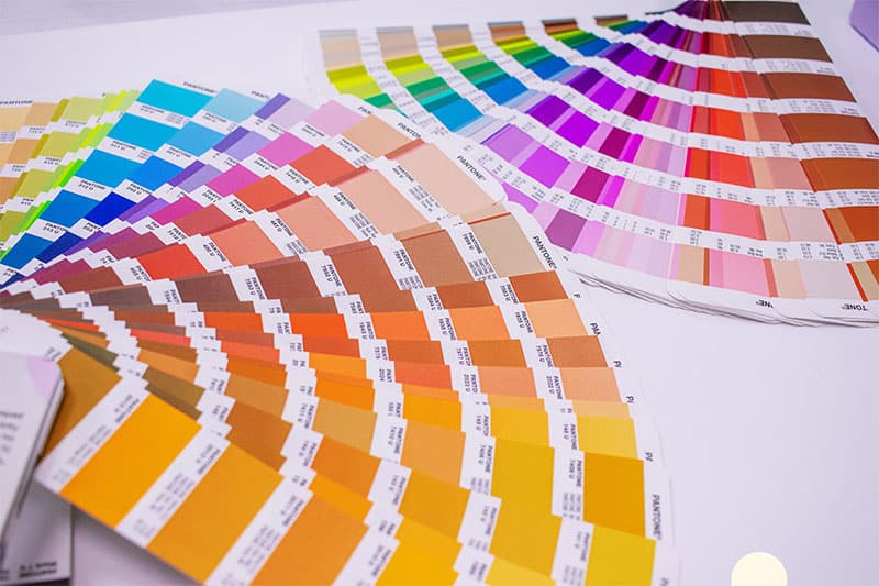
Colour is a universal language and plays a significant role in print design. It can evoke emotions, set the tone for your brand, and communicate messages without words. In this post, we will explore the captivating world of colour psychology and provide valuable insights into selecting the perfect colour palette for your print materials.
Understanding the Psychology of Colour
Colour psychology is a fascinating field that examines how colours can influence human behaviour, emotions, and perceptions. Each colour has its unique associations, and understanding these can help you craft print materials that resonate with your audience.
The Basics
Before we dive into the intricacies of colour psychology, let’s establish a foundation with some fundamental associations of primary colours:
- Red: This bold colour signifies passion, energy, and excitement. It can grab attention and convey urgency, making it effective for limited-time promotions.
- Blue: Blue exudes trust, calm, and professionalism. It’s a favourite in corporate settings and can create a sense of reliability and security.
- Yellow: Yellow is associated with optimism, warmth, and attention-grabbing qualities. It’s often used to convey happiness and positivity.
- Green: Green represents nature, health, and tranquillity. It’s perfect for eco-friendly brands or those promoting wellness.
- Purple: Purple is linked to royalty, luxury, and creativity. It can add a touch of sophistication and elegance to your materials.
- Orange: Orange radiates friendliness, enthusiasm, and affordability. It’s a vibrant and approachable colour often used in marketing.

Now that we’ve established the basic associations let’s delve into how to select the right colours for your print materials:
- Know Your Audience: Consider your target audience’s preferences, demographics, and cultural backgrounds. Different colours may have varying meanings in different cultures.
- Align with Brand Values: Your chosen colours should mirror your brand’s identity and values. For instance, an eco-conscious brand might opt for earthy greens and browns.
- Consider the Context: Think about where and how your print materials will be used. The colours suitable for a children’s toy catalogue may not be ideal for a financial report.
- Create Emotional Impact: Use colour to evoke the desired emotional response. For example, red can convey urgency, making it effective for limited-time offers.
- Use Colour Harmonies: Explore colour harmonies like complementary, analogous, or triadic colour schemes to create visual harmony and interest in your materials.
- Test, Iterate, and Get Feedback: Don’t hesitate to experiment with different colour combinations. Conduct A/B testing if possible and gather feedback to fine-tune your choices.
The Role of Print Materials
Different print materials serve various purposes, and your colour choices should align with these goals:
Business Cards: Colours should convey professionalism and make a memorable first impression. Classic choices include shades of blue and grey.
Brochures: Consider readability and visual appeal. Use colour to guide readers through content and highlight key information.
Posters and Banners: Bright, attention-grabbing colours work well for promotions and events. Think about contrast for readability.
Packaging: The colours on packaging should reflect the product, its qualities, and the brand’s identity. Packaging colours can influence buying decisions.
The power of colour in print design cannot be overstated. It’s a versatile tool that can captivate, engage, and influence your audience in subtle yet impactful ways. By understanding colour psychology and strategically choosing your colour palette, you can create print materials that effectively convey your message, evoke the desired emotions, and leave a lasting impression on your audience.
Incorporate these insights into your print design process, and watch as your materials come to life with vibrant and meaningful colour choices that resonate with your audience on a profound level. Whether you’re designing business cards, brochures, posters, or packaging, colour is your ally in making a memorable impact.
Contact us today to explore how Screentec can help you bring colour to life!


Recent Comments