Fonts add a little flavour to any text you’re writing. Whether you’re creating a custom exhibition display or you’re picking some bold graphic text for a poster, your font can make or break the finished product. We all have a group of pet peeve fonts that we’re convinced are overused, but they rely on personal preference.
Regardless of your opinion, some fonts are universally disliked. You’d be clever to give these a miss unless you’re trying to inspire fury in the hearts of your audience. If you want people to appreciate your hard work, here is our breakdown of the top 7 worst fonts you really wanna avoid.
1. Comic Sans
You knew this was coming. Comic Sans has been the bane of our existence since our school days. It’s an overly round, stupidly cheery style of font that screams immaturity. There’s no creativity in selecting this style anymore since it’s the go-to for teachers across the UK. The only acceptable application for this font is in a meme as a joke. It may come back in style one day, but don’t hold your breath.


2. Zirkle
Zirkle looks alien, but in the worst way possible. It’s challenging to follow and bendy in places where it doesn’t need to be. There’s no difference between capital and lowercase shapes, which reflects how lazy the design is on the whole. The N and the Z are the same shapes, just at different angles. There are very few circumstances that would benefit from this typeface. Not aesthetically pleasing.
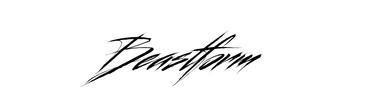
3. Beastform
Beastform is close to entirely illegible. It’s essentially just slashes of harsh lines on such a slant that you don’t know which way to turn your head. You certainly couldn’t print a sentence in this font, and even one single word could be challenging to interpret. At least it’s less round than Comic Sans and Zirkle, but Beastform is too far the opposite. It’s spiky and not inviting.
4. Papyrus
You’ll have encountered this old-school font. It’s a crowd-pleaser when it comes to cafe logo designers but supposedly lends its look to Ancient Egypt. Papyrus isn’t a challenging font to comprehend, but it isn’t impressive. There are purposeful irregular gaps where letters begin and finish. Papyrus reflects handwriting while looking inauthentic. Fabulous if that’s the look you’re striving for, but why would you?
5. Klute
If you’re wondering why this font looks familiar, even if you can’t put your finger on it, we’ll put you out of your misery. This font massively inspired promotional items for the London 2021 Olympics. Can you tell? After covering adverts plastered around the globe, the Klute font design can’t represent anything but competitive sport. It is recognisable and legible but ultimately useless for anything but events.
6. Monoton
Any amateur disco night will incorporate Monoton somewhere. Enough said. The font layers lines and gaps to form letters rather than block print. Some of the spacing between letters is strange, and numbers are much taller than lower-case letters. Big single words in this style are passable, but sentences in a smaller font size appear trippy. The white space in each letter makes the design seem glitchy. Not the best look!
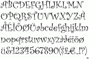
7. Curlz MT
Did somebody say let’s make a nine-year-old’s birthday party invitation? Curlz MT will get the job done, but it’ll upset all adults simultaneously. This font puts swirls and curls where swirls don’t need to be. Curlz MT’s small weight also makes it a problematic font to read in sentences. We’re pretty sure the design has caused misunderstandings for decades and resulted in parents rocking up to the wrong party location.
Contact us to create your next set of promotional items with the team at ScreenTec, as long as you avoid these fonts.
Recent Comments